Consumption for Automations
This page covers how to read the consumption charts in the Metrics tab and how to use them to make decisions.
The Metrics tab
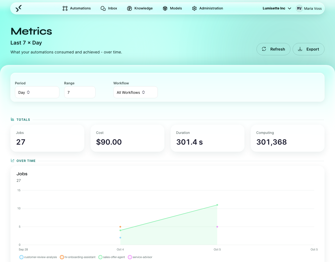
The tab answers two questions in two layers: Totals says how much, Over time says when.
Filters
Three filters sit above the numbers. They take effect as soon as you change them — there is no Apply button. The line under the page title always states the current selection, for example Last 30 × Day.
- Period — Day, Week, or Month. Decides the granularity of the chart.
- Range — how many periods to show.
- Workflow — All Workflows, or one specific automation.
Two buttons sit in the page toolbar:
- Refresh — forces a fresh fetch from the server.
- Export — downloads the current view as CSV (see Analyze and Export). It stays disabled while there is nothing to export.
Totals
Four tiles summarize the whole selected range:
- Jobs — how many automation runs.
- Cost — estimated total cost, AI and manual combined.
- Duration — total run time in seconds.
- Computing — total tokens.
Over time
Below the totals, five charts break the same range down per period:
- Jobs — number of runs. Useful for seeing trends in usage.
- Cost — AI cost and manual cost, the latter as a dashed line. The dominant chart for budget decisions.
- AI Token Cost — input cost against output cost. Useful when the cost is unclear and you want to know what drives it: output tokens are typically more expensive than input tokens on most providers.
- Duration — run time per period, with the derived duration cost as a dashed line. Sharp spikes often correlate with provider outages or a long system prompt.
- Computing — tokens per period.
If the selection yields nothing, the page says so (No measurements in the selected period) instead of showing empty charts. If metrics are not part of your license, the page says that too.
How to read them
Cost
Look for trends, not absolute numbers:
- A flat line at high cost is fine if the workflows are doing useful work.
- A flat line at low cost is fine.
- A slowly creeping upward line means something is growing — usage, content size, or a slowly-bloating system prompt.
- A sudden spike means something changed — a new automation was activated, a knowledge grew dramatically, or a misbehaving loop in an agent.
Tokens
If cost is high but you can't explain why, the token chart often points at the cause:
- Lots of input tokens — the prompt itself, the context memory, or the knowledge retrieval is bringing in too much.
- Lots of output tokens — the model is being asked to write long responses where it should be writing short ones.
Duration
Slow steps are usually:
- An AI action with a very long input or a slow model.
- A knowledge query against a very big knowledge.
- A network-bound integration (HTTP Request, Database Query) hitting a slow target.
If the duration spikes correlate with provider outages on the same day, the cause is upstream.
Job count
A healthy workspace tends to show a steady or growing job count, with failures concentrated in one or two automations — those are then the candidates for review. The Metrics tab counts runs; which of them failed you see in the jobs list of the automation itself, where the filters split the runs by state.
A typical investigation
You notice this month's cost is double last month's. Step through:
- Set Workflow: All Workflows, Period: Month, Range: 6. The increase is visible on the cost chart.
- Switch Workflow to the largest-cost candidate. The charts follow immediately.
- The cost chart for that automation tells you whether it is the driver.
- If yes, open the automation editor. Look at recent jobs to see what input size each step is processing.
- Often the cause is a knowledge that grew (longer retrieved context = more input tokens) or a system instruction that someone edited to be much longer.
Recommendations
- ✅ Check Metrics at least weekly while a workspace is new. Surprises are easier to catch early.
- ✅ Use the Workflow filter when investigating, not the global view.
- ✅ When optimizing, measure before and after. Tune one thing, run for a few days, compare.
- ⚠️ Daily granularity is noisy. Weekly is usually the right view for trend spotting.
- ⚠️ The cost shown is an estimate; the provider's invoice is authoritative. They usually match closely, but reconcile monthly if precision matters.
- ❌ Do not optimize aggressively for cost on automations that bring obvious business value. The most expensive automation is the one that should run and doesn't.
What to do next
- Analyze and Export — pull the numbers out for further analysis.
- Models → BYOK — reconcile with the provider's billing.